Muze Pens Shopify Storefront
See StoreLed UI/UX design and front-end development for a Shopify pen shop revamp, including an engraving feature.
Role
UI UX Designer and Front-End Developer
Timeline
August - October 2025
Team
Solo
Skills
Figma, UI UX, Front-End Development, Shopify
Summary and Impact
During my time at Muze Pens as a contractor, I worked on re-designing the storefront and the development of a new engraving feature, with the goal of boosting conversion rate and improving user experience. After the new version had been pushed, the shop saw an increase of 5% in conversion rate, and 14% increase in sales.
01 Context and Research
Muze Pens is experiencing a decrease of conversion rate despite having good traffic.
Before I started my design revamp, I examined the user behavior on the site by installing microsoft Clarity, which gave me a heatmap of what areas customers would give attention to, and the highest frequency pages within the site.
I will be incorporating my findings with the design iteration to explain the reasoning behind my design decisions.
Current Painpoints
Website was unable to retain customer due to long pages that increases scroll time.
There aren't enough images on the site compared to long paragraphs of text.
The website has small text that customers struggled to read, with low visibility.
The website has broken navigation that leads nowhere.
Customers had to go to the store physically to put an engraving order, and expressed wishes to be able to do it on their phones.
Proposed Solution
Reduce the page content height by removing unnecessary sections, and also by grouping product tabs.
Add more visuals and images to catch the customer's attention.
Improve typography for better visibility.
Redo menu categorization and fix broken links.
Engraving app embedded into the product purchase user flow.
02 Design Iteration
Design Highlights:
- Improved Navigation
- Making the Landing Page concise and visual
- Mobile Product Page Optimization
- Simulating In-store Experience with Engraving Functionality
Improved Navigation
Navigation is one of the most important elements in an online shop.
User Behavior:
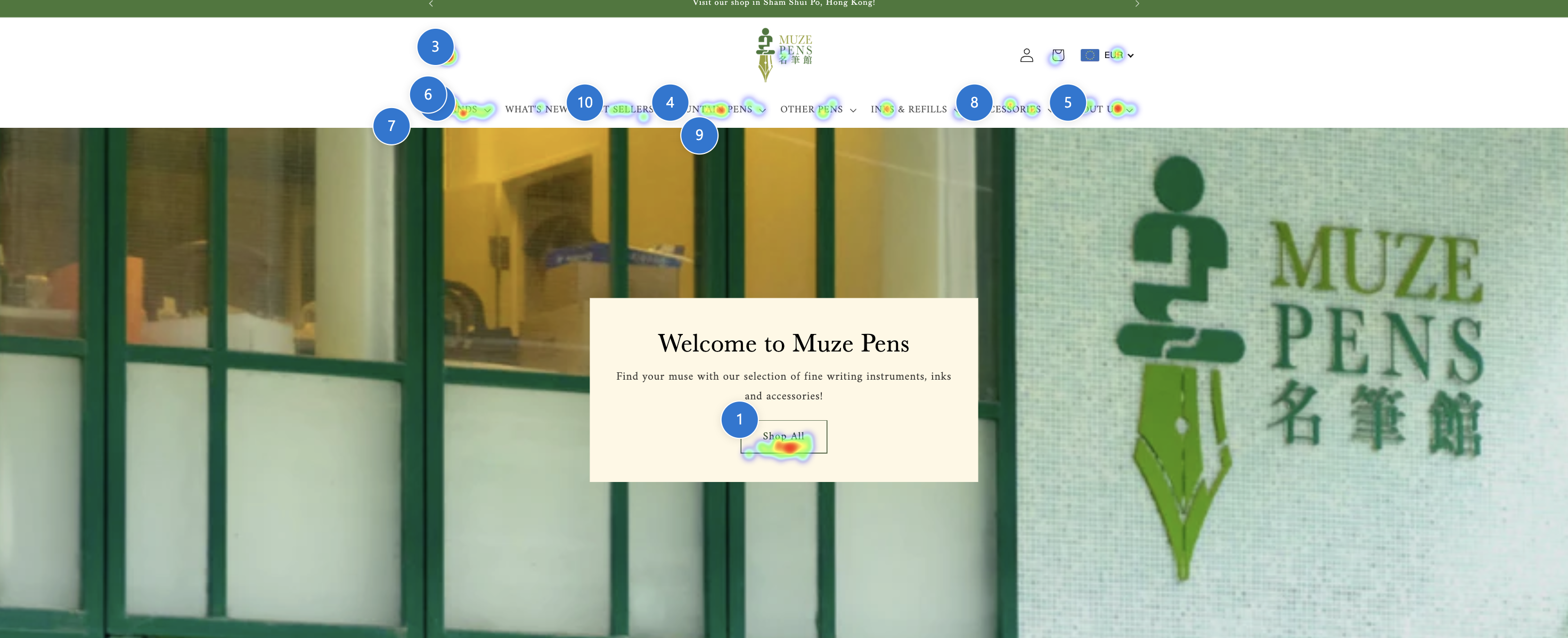
From this heatmap collected by Clarity, we can see that customers give attention to the menu first, and go straight to "What's New" and "Brands". It is clear that customers give high priority to the nav bar, and hence there should be less clicks and friction to make their experience more seamless.
Currently the customers are facing two frustrations.
- Having to click on the menu items to expand
- The menu is too small, which impacts accessibility, especially when many fountain pen customers are older, and prefers larger fonts.
To solve this issue, I made the menu simple to use.
The submenu becomes a mega menu, with larger surface area that improves accessibility and visibility.
Making the Landing Page Concise and Visual
Currently, the page has a lot of text clutter and unnecessary sections that makes the site less appealing to look at.
According to user behavior studies by Nielsen Norman Group, conversion rate is higher for websites with less scrolling, more visuals, and less text.
In the heatmap, we can see that customers give attention to the top section landing page, and the menu items, and no one scrolls to the bottom.
Therefore, it makes sense to focus on the top section of the landing page, I did the following changes:
Making the landing slideshow and banners more visual, with larger images.
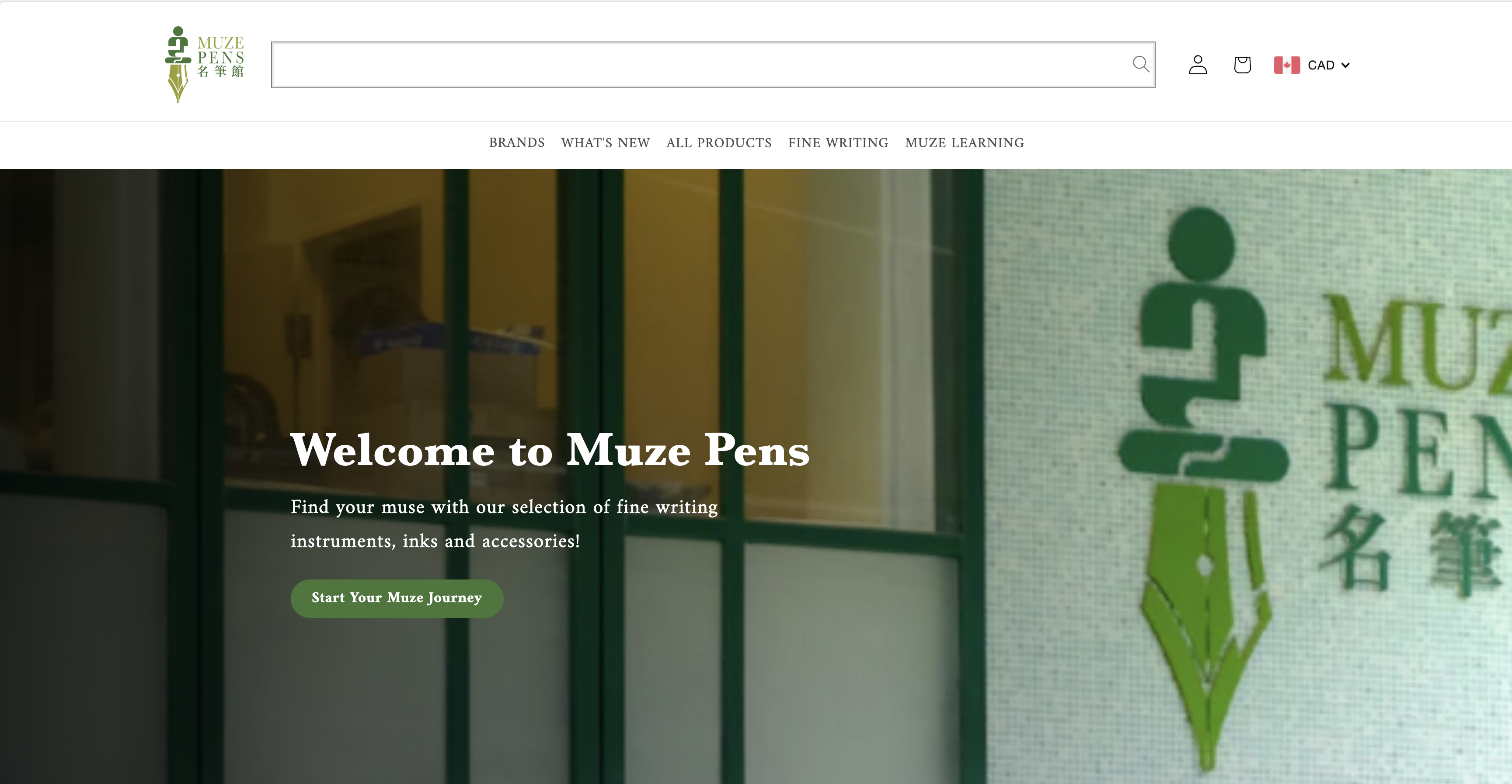
Bigger CTA to guide customers to start shopping.
Mobile Product Page Optimization
Looking at Clarity, I found out that customers tend to order pens more through mobile, hence the mobile experience of the site is incredibly important.
With this in mind, I started optimizing the product page.
Current Problems:
- The page scrolling is too big and displays less crucial information
- Missing CTA at first glance
To solve this, I redesigned the product mobile page.
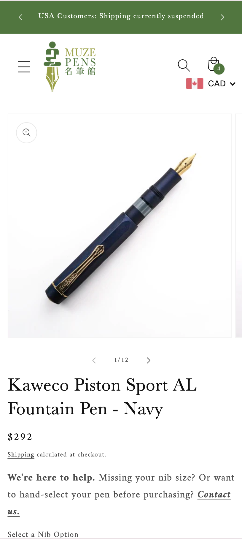
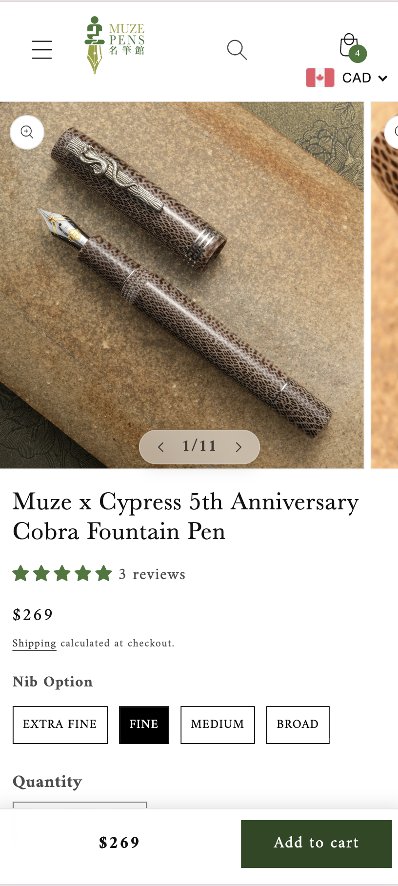
- Reduced text size and gallery size to make way for product information such as swatches
- Made the add to cart CTA as a sticky bar, so that it will always be on the screen to boost conversion rate
Simulating In-store Experience with Engraving Functionality
According to the store owner, customers wanted to engrave their pens not only in-store, but also online.
In order to make the online shopping flow closer to the in-store Muze Pens experience, and to increase revenue, we decided to add an engraving functionality to all pens. We looked at other competitors, and found that their way of adding engraving is quite cumbersome.
Common problems were as followed:
- Users have to use a toggle to enable engraving
- Lack of contrast in color in pen engraving previews due to the pen color having the same color as the engraving text
- No Chinese engraving support and text orientation option
With this in mind, I created the engraving app with better user experience.
Step 1:

User navigate to the pen product, and select the "Add Engraving" button.
Step 2:
User selects engraving language, font, then inputs the text for a pen preview.
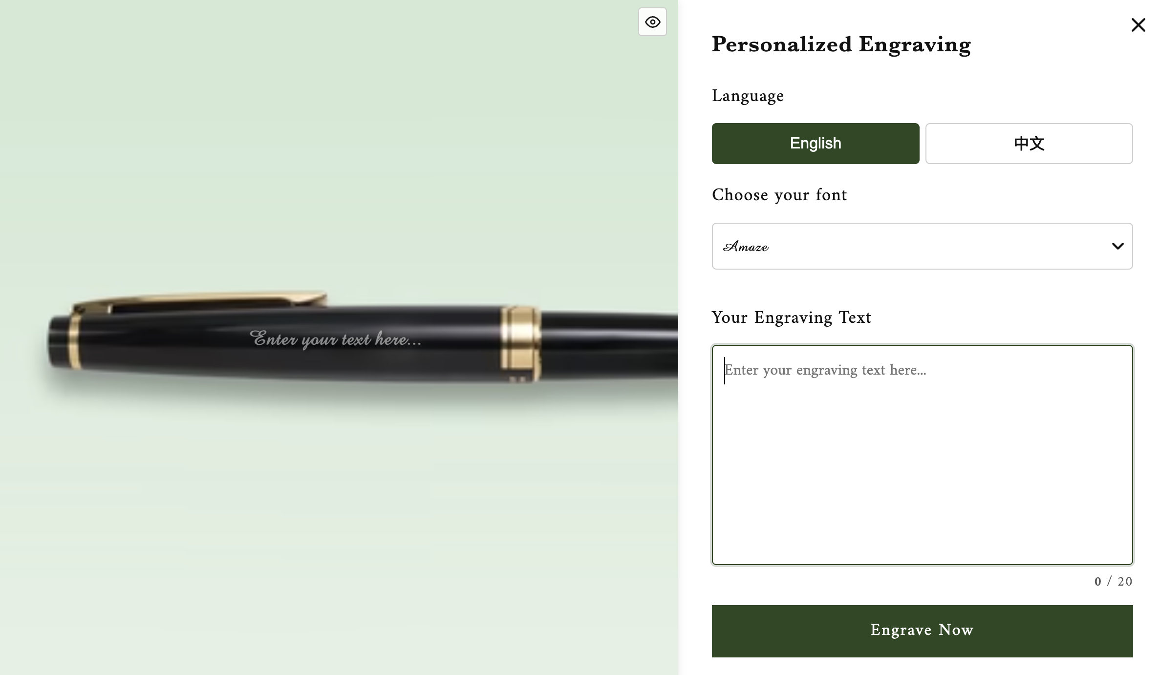
Depending on the pen body color, text color with contrasting color will be shown for better accessibility and visibility.
The language selected will also affect the text orientation.
The fonts names are displayed with their respective font styles for easy selection.
To further enhance visibility, users can toggle the pen preview on and off, and see the text preview only.
Step 3:
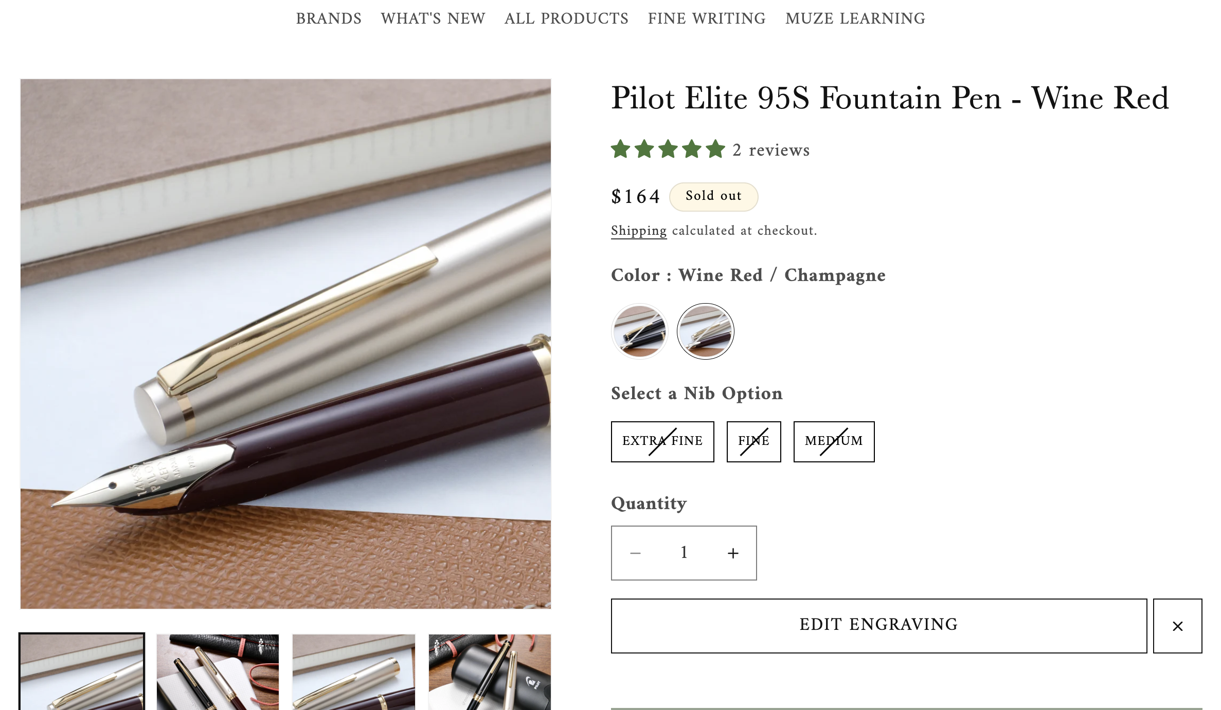
After the user confirms the engraving information, they can either edit the engraving or cancel it. If they are ready to order, they can click add to cart, in which they are able to add the pen with the engraving service attached.
03 Challenges
1. Communication
My client was not familiar with tech and the Shopify platform. Therefore, to bridge the gap, we developed an SOP document where new features were explained in layman terms, with detailed steps on how to access previews. Through this, I've learned to effectively communicate with my client as I had used overly complicated terminology when explaining my design decisions.
2. Navigating the Shopify Platform
The Shopify platform is quite different from the frameworks I had worked with, and had more limitations than I anticipated. I had to delete sections and change design decisions because of the javascript and API impacting load speed. Example being that I was not able to load more product categories on the landing page due to the slow speed of Shopify API fetching products. Since fast page speed was crucial to good SEO, I had to delete multiple sections and product scrolling designs to keep the page speed fast.