Sharpen
View DemoLed UI/UX design and front-end development for an AI application assessing medical students' virtual patient communication for Scarborough Health Center
Role
UI UX Designer and Front-End Developer
Timeline
August - October 2025
Team
2 Back-end Developers, 1 Tech Lead
Skills
Figma, UI UX, Front-End Development, NextJs
Summary and Impact
During my time at Scarborough Health Center as a contractor, I led the design and front-end implementation for Sharpen, an AI powered medical consultation simulation and evaluation platform. Since the market research and prototyping was done before hand, as a contractor, I revamped the UI UX with high-fidelity prototyping in Figma, and implemented the design using NextJS and ShadCN in a fast turnaround design sprint within one month.
Current Painpoints
For Teaching Staff:
Standardized Patients are costly and hard to access.
Grade Evaluation can be biased due to teaching staff fatigue
For Students:
Standardized Patients are hard to access, and hence less chances to practice
Grade Evaluation involves complicated rubrics with different formats, which students struggle to process their performance
Proposed Solution
AI agents that are online 24/7, offering on-call simulation practices for medical students
User-friendly Evaluation UI that outlines evaluation items in one simple format, and offer AI suggestions for improvement
AI Grade Evaluation generated using video, audio and transcript data, reducing workload of staff
01 Context and Research
Scarborough Health Center is looking for ways to make medical education less costly and biased in grade evaluation.
Goals
- Virtual Patient Call Page that simulates real life medical consultation for students
- Student Facing Evaluation Page that translate complicated rubrics into easy to read cards
- Landing page that attracts interested parties in requesting a demo for Sharpen
Archetype
To better understand the students Sharpen was designed for, I created an archetype based on conversations with healthcare students and insights from the project team.
A student studying Nursing: A final year nursing student preparing for her exam. She tries practicing with peers, but often feels unsure whether her communication skills are improving.
Goals
- Improve her confidence when speaking with patients
- Receive clear and timely feedback
- Track progress and see measurable improvement over time
Frustrations
- Limited opportunities for real or simulated patient practice.
- Feedback that feels inconsistent or unclear.
- Difficulty tracking progress for multiple courses and rubrics.
Behaviors
- Practices short simulation sessions after classes.
- Checks progress dashboards for reassurance.
- Prefers clear, structured rubic feedback webpages that are easy to understand.
02 Design Iteration
Here are the design changes I made to the pre-existing MVP.
Menu Navigation
The first thing I did is to re-design the side bar.
I added smaller subtitles to help users understand the page's categorization for easier navigation.
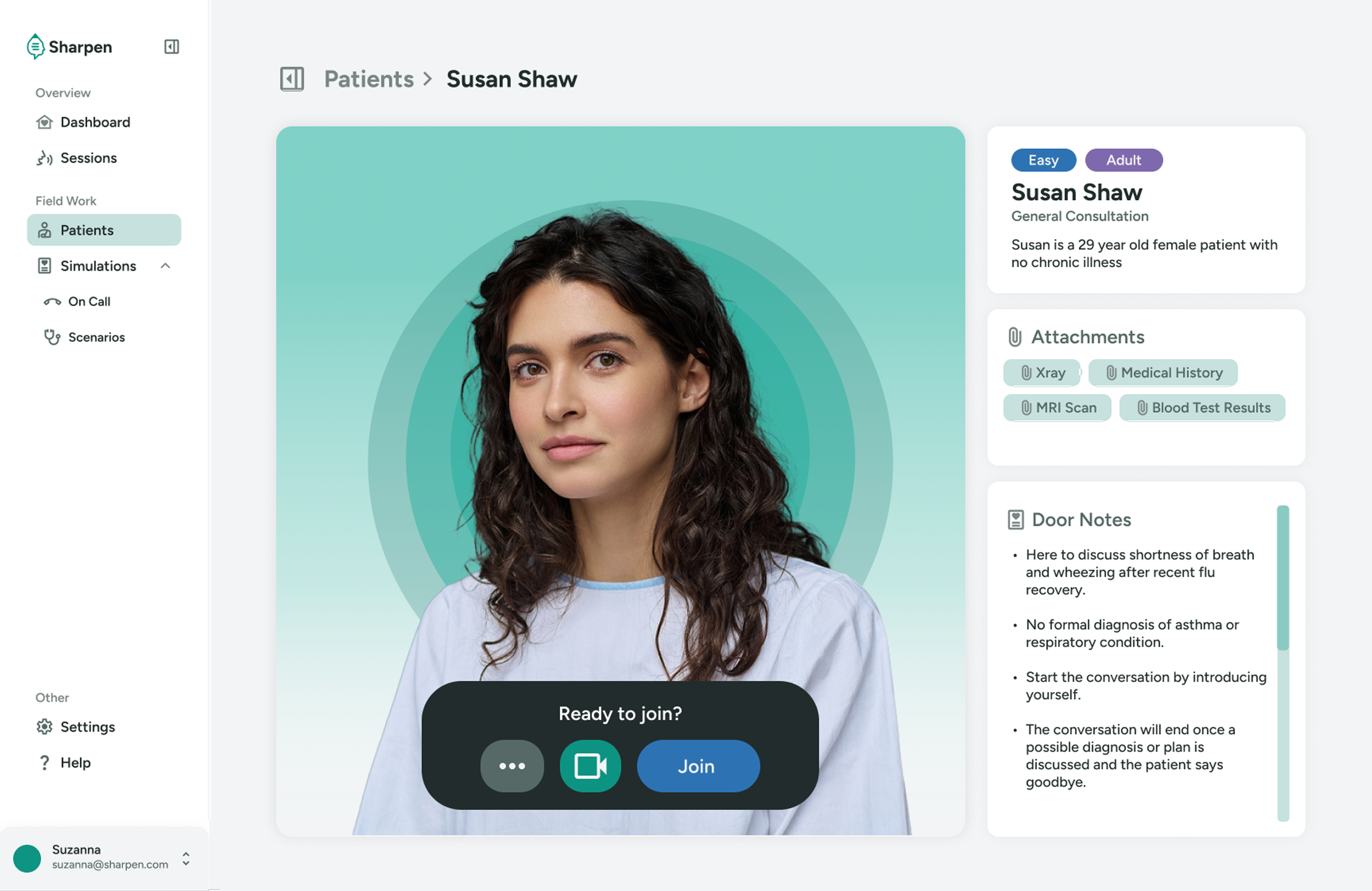
Patient Call Page
Based on the pre-existing MVP, I designed a new patient call page that simulates a real life consultation scenario better. The original MVP lacked visuals that help students engage better with the AI agent.
Call Interface
I modelled the call page similar to virtual video call softwares, as students will perform virtual consultations in this setting.
Students can see the neccessary information on the right side, such as patient information and door notes.
During the call, students can see their own facial expression and body language, and the AI will provide feedback on their performance.
Movable Attachment Popup
Attachments are also added to the call page, as students may need neccessary medical history or scans.
To avoid covering the call interface, the attachments are placed in a movable popup modal.
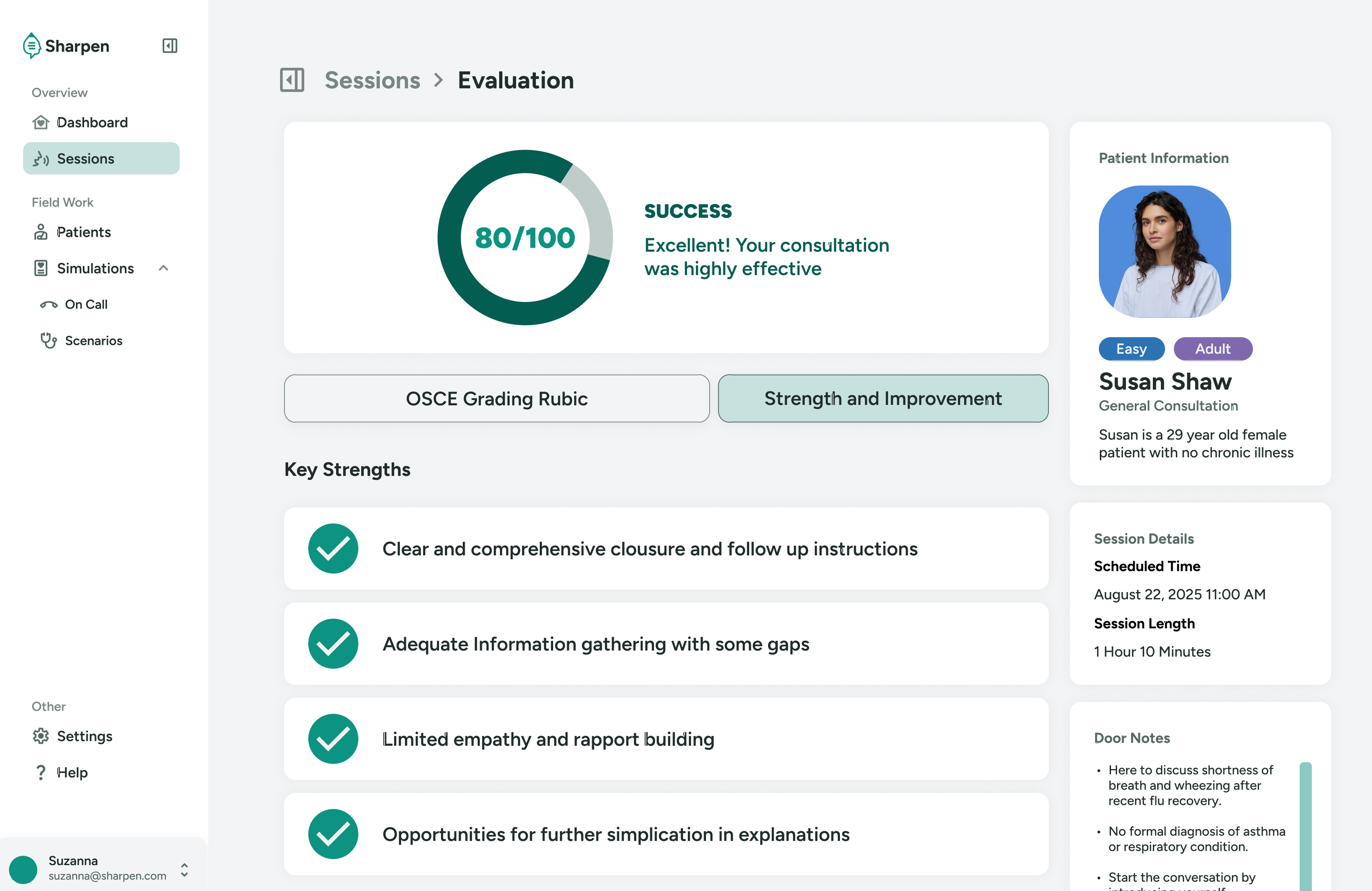
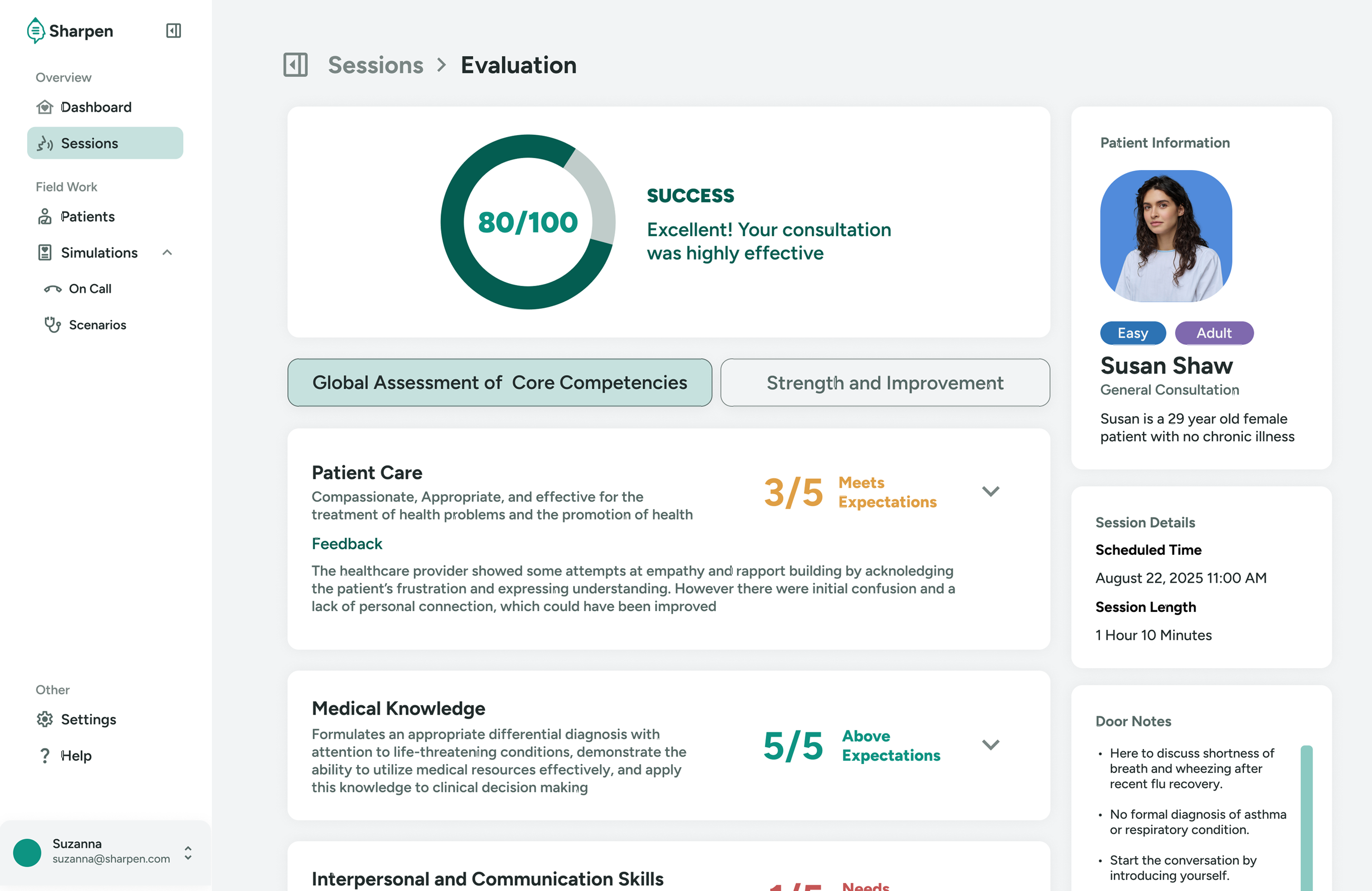
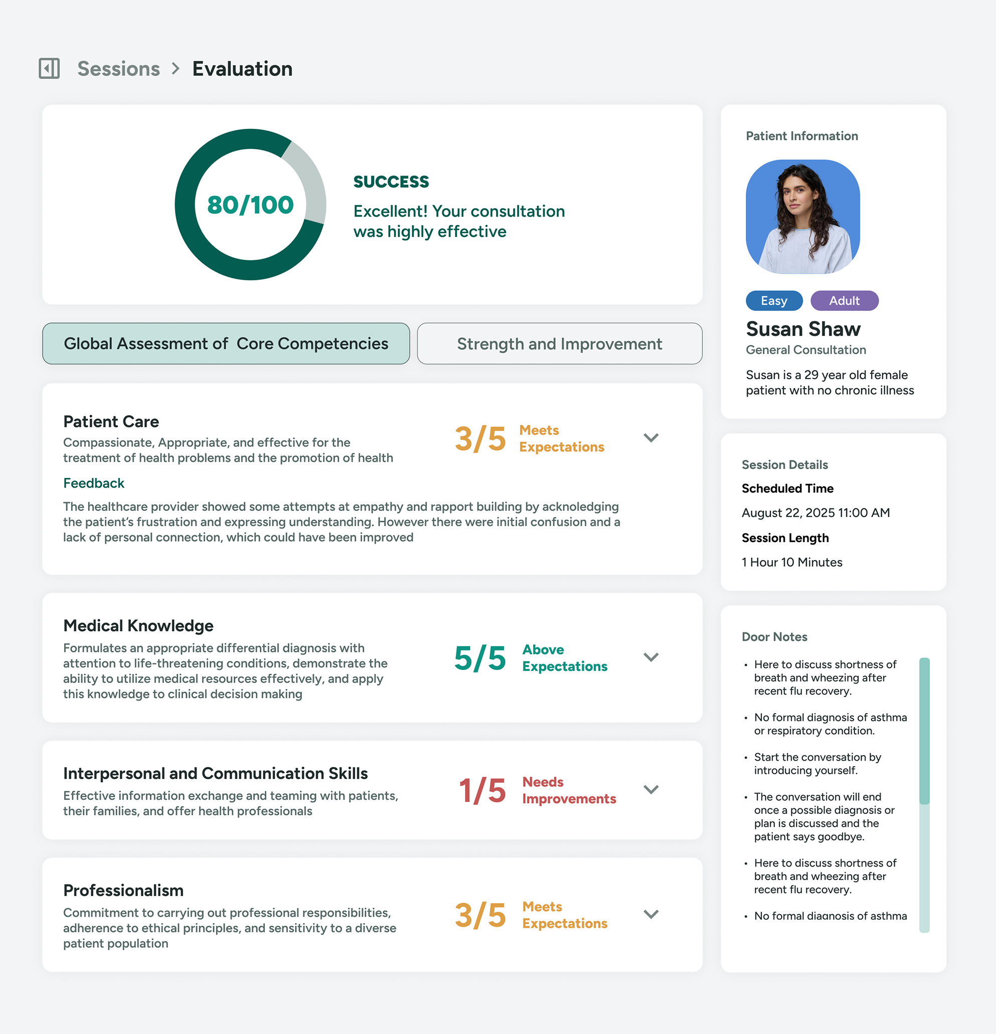
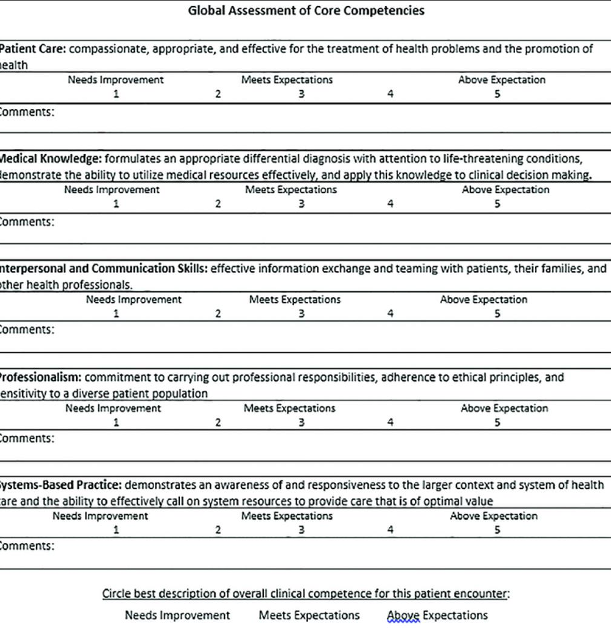
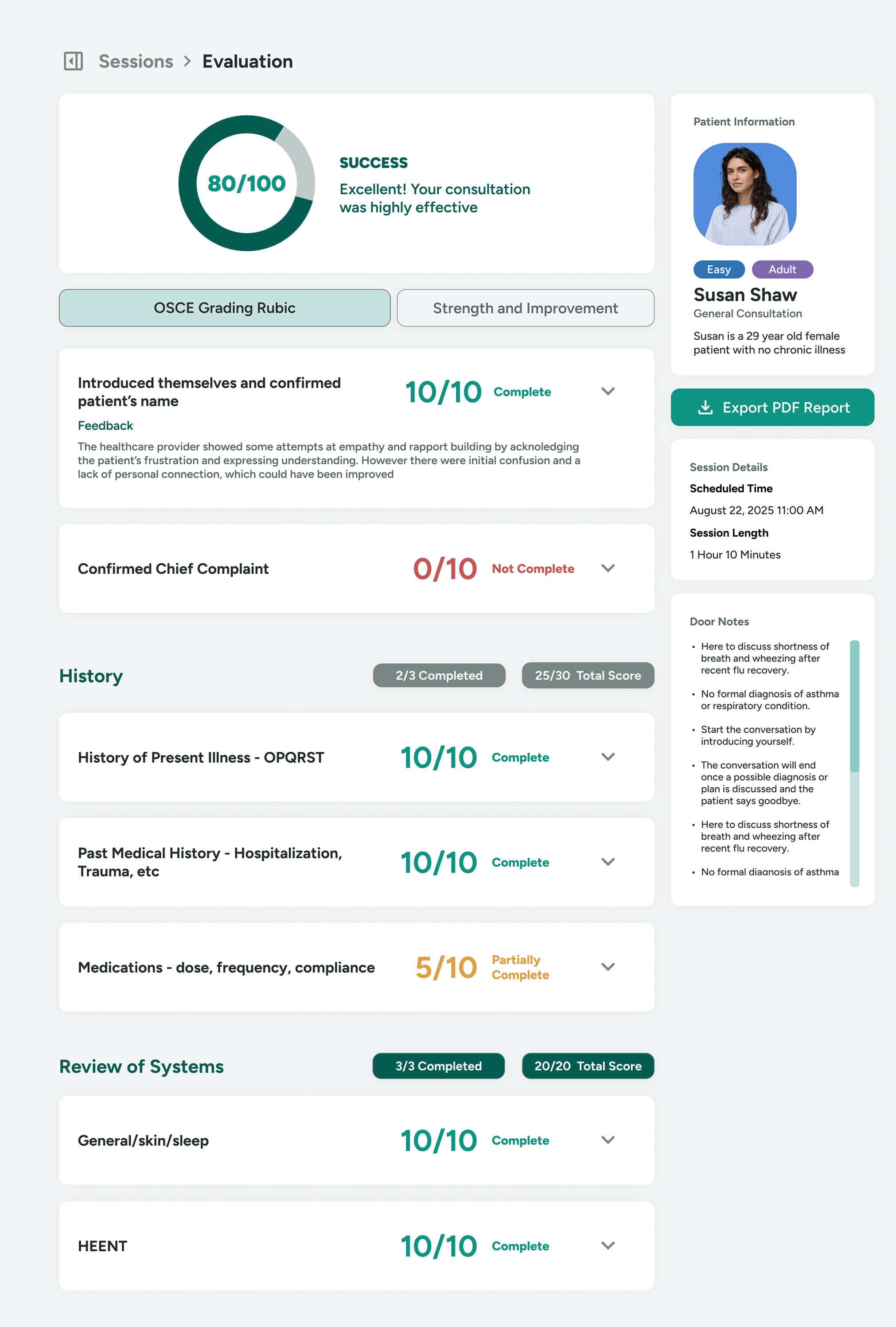
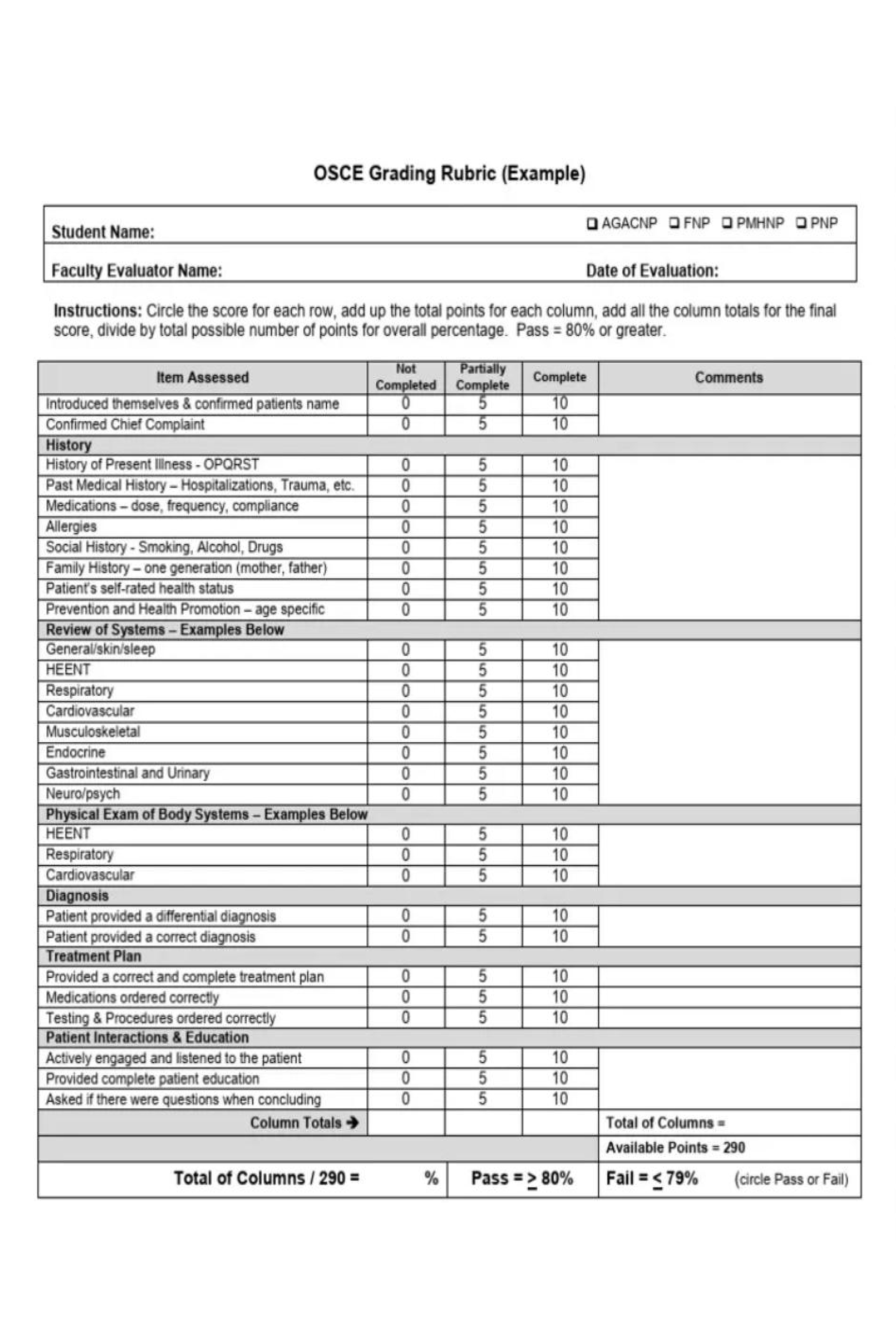
Evaluation Page
I designed a new evaluation page that adpats complicated rubics into a simpler format.
The evaluation page condenses the complicated rubics into a simpler format, and shows the score at first glance.
An accordion component is used here to progressively disclose lengthly feedbacks.
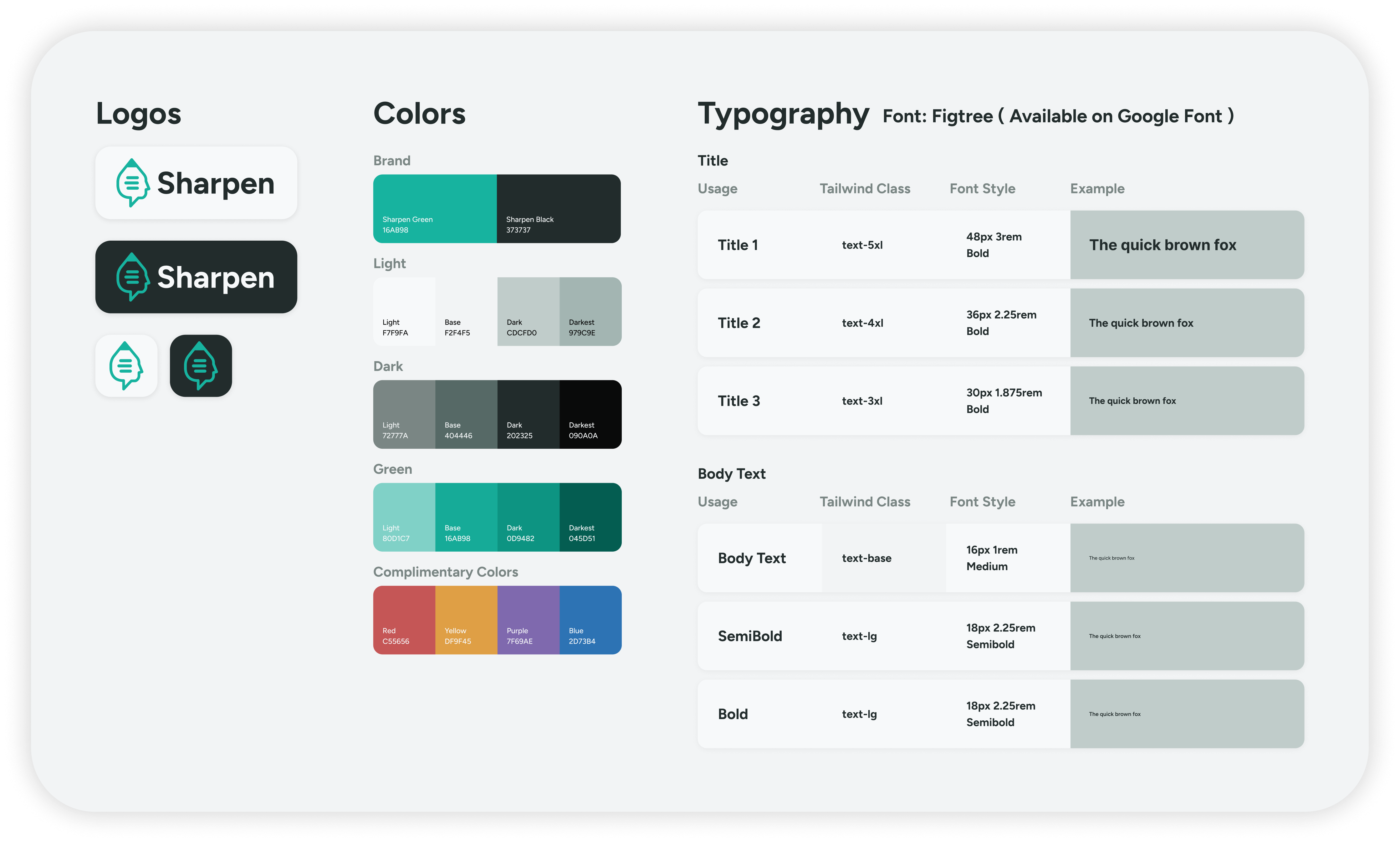
03 Design System
Created a flexible design system for Sharpen with clean, adaptable branding optimized for white-label use by medical organizations.
04 Challenges
While working on Sharpen, I encountered several challenges, mainly fast-approaching deadlines and limited research data.
Fast-Approaching Deadlines
Our team consisted of two backend developers and a project manager, which meant I was responsible for both designing and coding the interface within a short timeframe.
To manage this, I learned to leverage AI-assisted tools to generate design tokens and systems within Tailwind CSS. This allowed me to apply consistent styles quickly by referencing pre-defined Tailwind classes, enabling faster iteration and delivery without sacrificing design quality.
Limited Research Data
Sharpen was part of an experimental program exploring new applications of AI in medical education. Coming from a humanities background, I had limited subject knowledge and access to research data.
To bridge this gap, I proactively collaborated with the team and interviewed friends studying nursing to better understand the needs of healthcare students. These insights helped me design user flows and interfaces that aligned more closely with real-world learning contexts for medical schools.